Do you often find yourself wondering if you should run a report or a search in NetSuite? Are you running searches but exporting the data to another source for editing or formatting? Are you new to NetSuite, or are you a user with little understanding of complex record schemas? SuiteAnalytics Workbook beta is a brand-new feature that came out in NetSuite’s 2018.2 release and it combines the best of Reports and Searches in one easy to use tool. Some of the main features are highlighted below:
- Drag and Drop Editing
- Multi-Level Joins, Joins to Custom Records
- Pivot Capabilities
- Custom Field Formulas
- Export to CSV
- Formatting Options
- Report Sharing
- Criteria Filters
- Heading Filters and Sorting in Results
- Subtotal/Grand Total
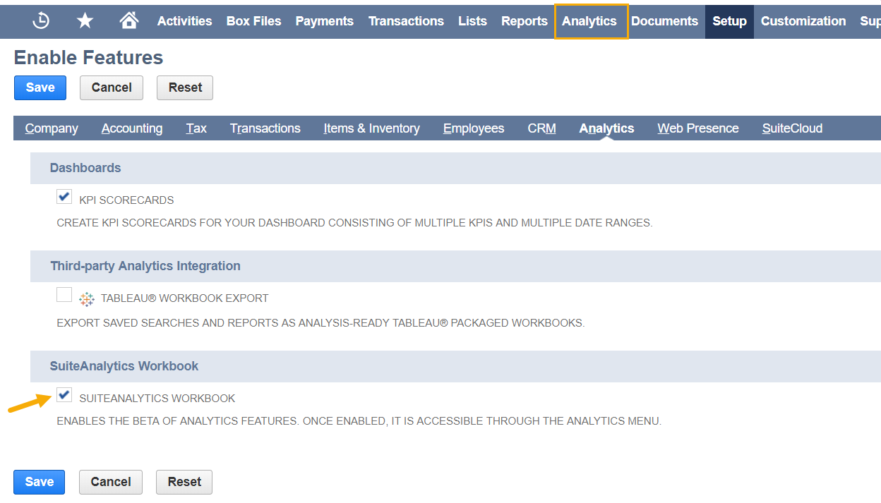
To get started, enable the use of SuiteAnalytics Workbook by going to Setup > Company > Enable Features, and click the Analytics subtab. Scroll down to the SuiteAnalytics Workbook section and check the SuiteAnalytics Workbook box to enable the feature. After saving, you should see an “Analytics” tab to the right of reports in your main navigation menu. If not, you may need to log out and back in again for the menu to update.
Before running any report, it’s good practice to spend a little time planning your report; ask yourself the three main questions: Who will be using or viewing this report? What type of information do I need or don’t I need? When and how often will I run and use this report? Spending a few minutes planning the layout can save you time and ensure that you don’t forget to add any critical information to your report. For our purposes today, we are going to look at some sales reports to highlight the Workbook functionality.
Step 1: Select Record Type
Select the Analytics tab in your main menu. Before building a workbook, you must choose a record type to begin your report. For our purposes, we are using “Transaction” as the base record type. Once you have selected a record type, a new workbook will open pre-populated with standard data related to the record type. There are three main tabs in the workbook; Data, Criteria and Pivot. The Data tab displays your source data, the Criteria tab displays filtering options, and the Pivot tab allows you to view the data in various layouts. The workbook defaults to the Data tab first.
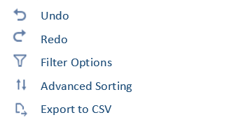
Notice the icons displaying on the left side of the report menu:
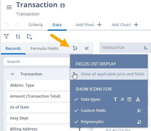
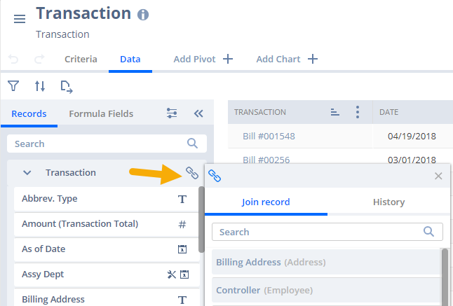
In addition, there are display and join icons in the report builder table.
At any point you may hover over a field to reveal an iicon, which will display field level help when selected. You can also save your work by using the ≡ icon at the top left of the report menu.
Step 2: Building your report
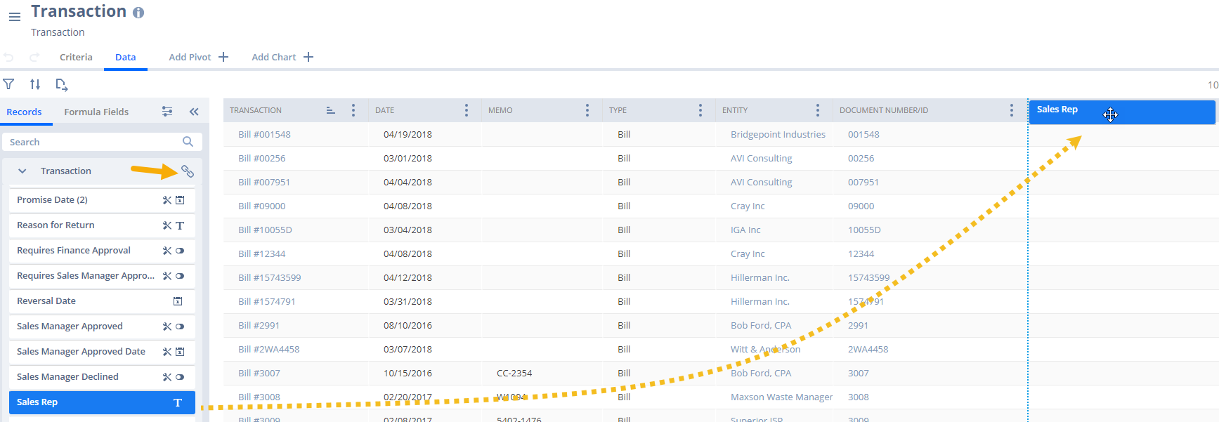
In the data tab, select the data that you want to include in your report. Add data fields to your report by double clicking on the field or by dragging the field to the desired location in your table. The [join icon] will display available join fields so that you can dig into customer or item specific data. For our purposes, we are joining Transaction data with Transaction Line level data, Customer record data and Item record data to build our sales report.
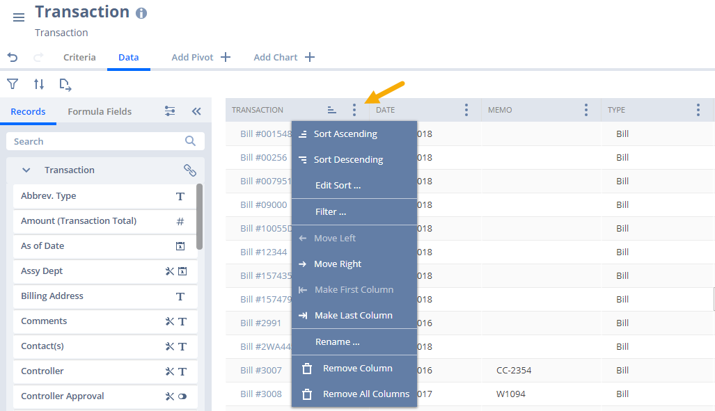
At any point, you can edit your columns by clicking the ⋮ icon to the right of the column header.
Step 2: Filter your Data
Once you have added the desired data to your report, you can move on to the criteria tab to apply filter conditions. You can filter data by either double clicking on the field or by dragging the field to right. At any point, you can use the Reset Criteria function clear all filters. This does not remove any data, only the filter criteria.
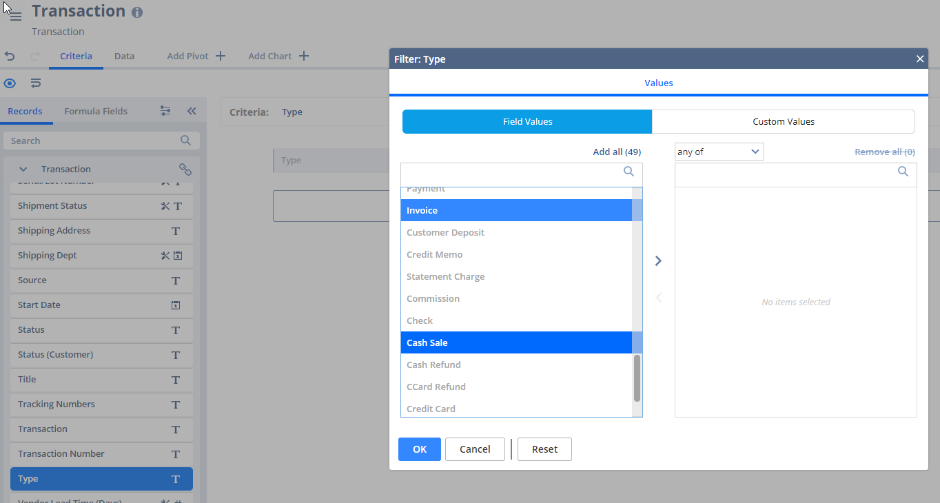
Selecting fields in the criteria tab will bring up an additional window. You can select up to four options for filtering the data, depending on the type of field that is selected. For hierarchical fields, you can set any of the following filters at the child or hierarchy level:
- Values: Existing values or dates from the source data, or custom values
- Ranges/ Date Ranges: Range of values or dates available in the source data
- Relative Conditions/ Relative Dates: Conditions relative to the existing values in the source data
- Conditions/ Specific Dates: Specific value or date and an expression
For our purposes, we are looking for sales transactions, so we filter Type to be any of Cash Sale and Invoice.
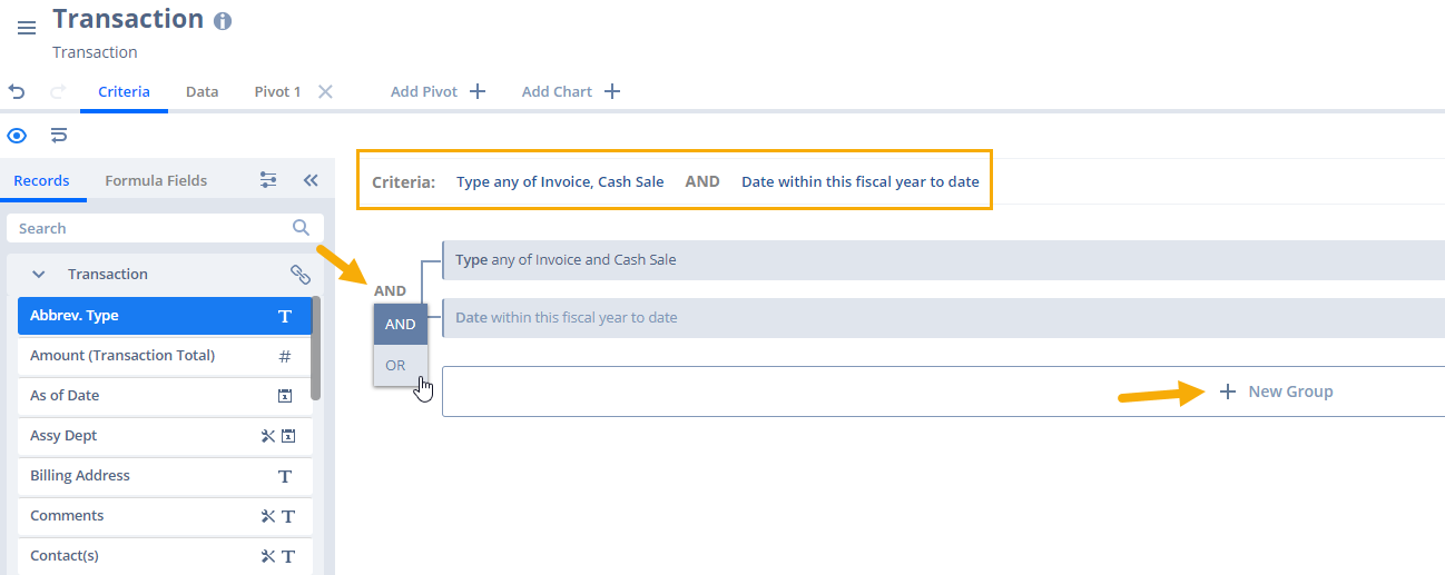
When applying multiple filter options to a data field, the default operator is AND, but you can change to OR. To apply filters to a separate data field, select that field from the menu and start a new criteria group to the right.
Step 3: View Your Data
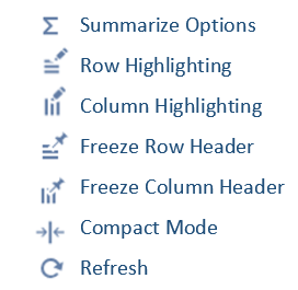
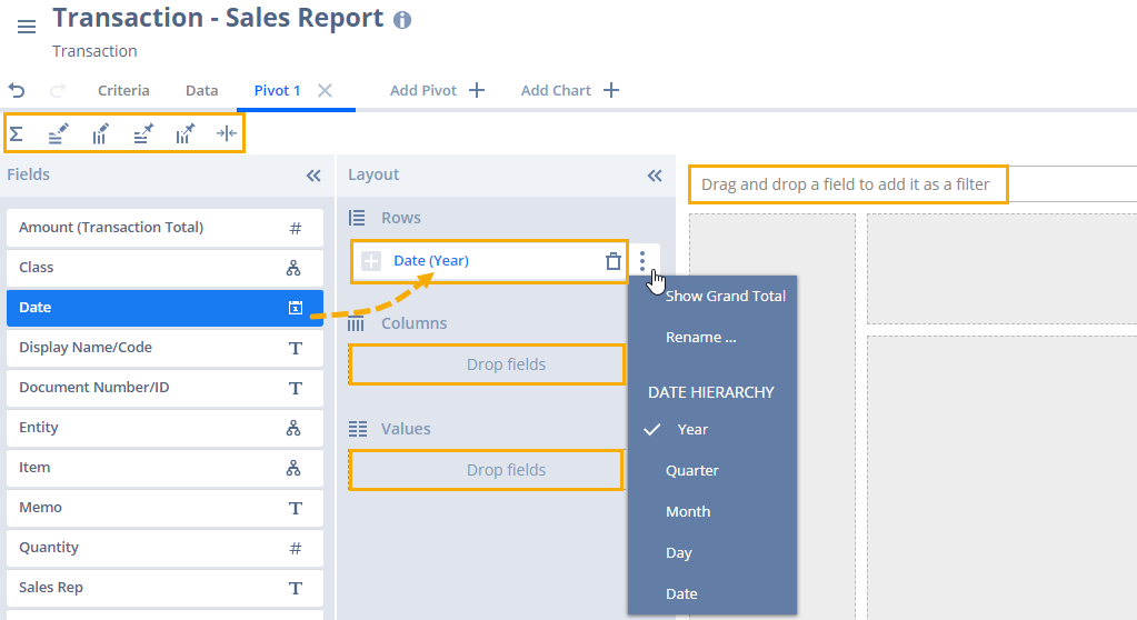
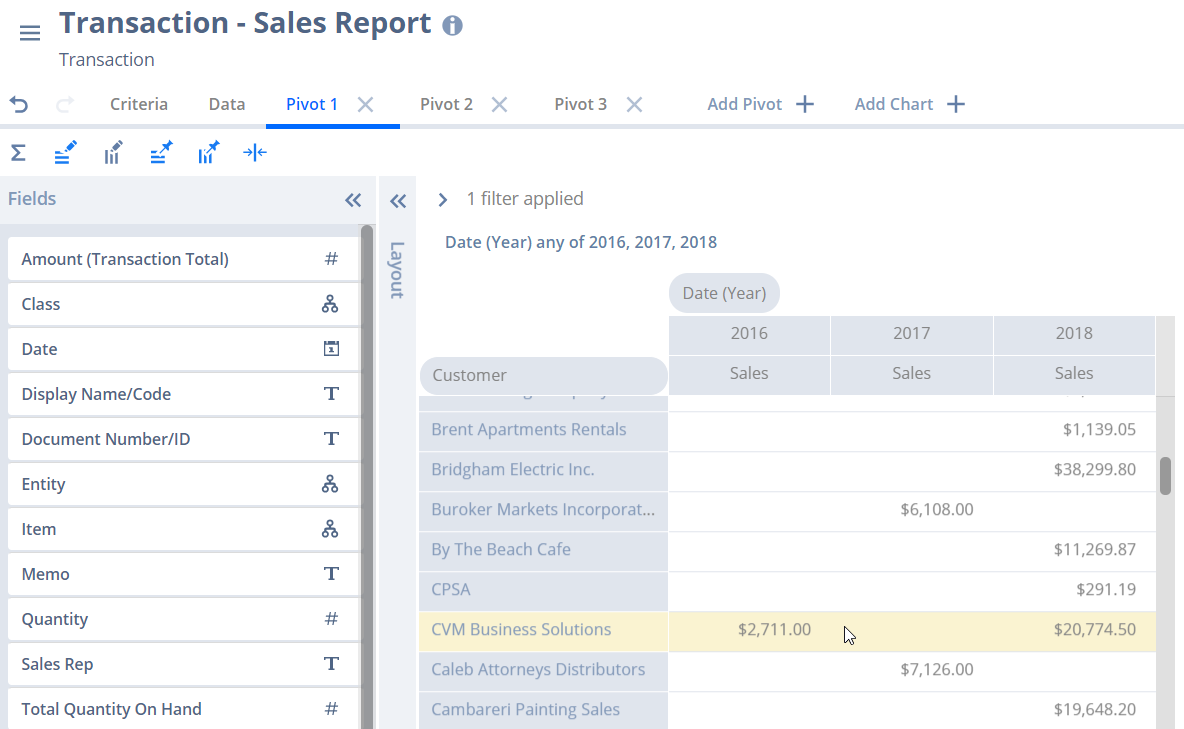
Once you have added data and criteria, you can begin formatting your report. If you have used a pivot table, this tool will look very familiar. The three basic parts of the table are Rows, Columns and Values. You can play around with the layout until you have the view and format that you’re looking for. Then, you can move on to some additional customization, like totals, highlighting, and freezing rows/columns to look at larger data sets. Note the icons at the top of the report builder menu:
To add data to your pivot table, simply drag and drop the desired field to the Row, Column, Value or Filter box to the right. To ensure that you are accessing live data, you must click the P [refresh icon, top right] after adding or editing fields or formatting your layout.
Change your field format by clicking the ⋮ icon in the layout builder. You may want to reformat number values or rename titles to make the results easier to understand. For instance, instead of “Amount (Transaction Total)” you may want “Sales,” instead of “Entity” you may want “Customer.” Enabling the highlight options allows you to hover over a row or column and highlight the results, making analysis a bit easier on the eyes.
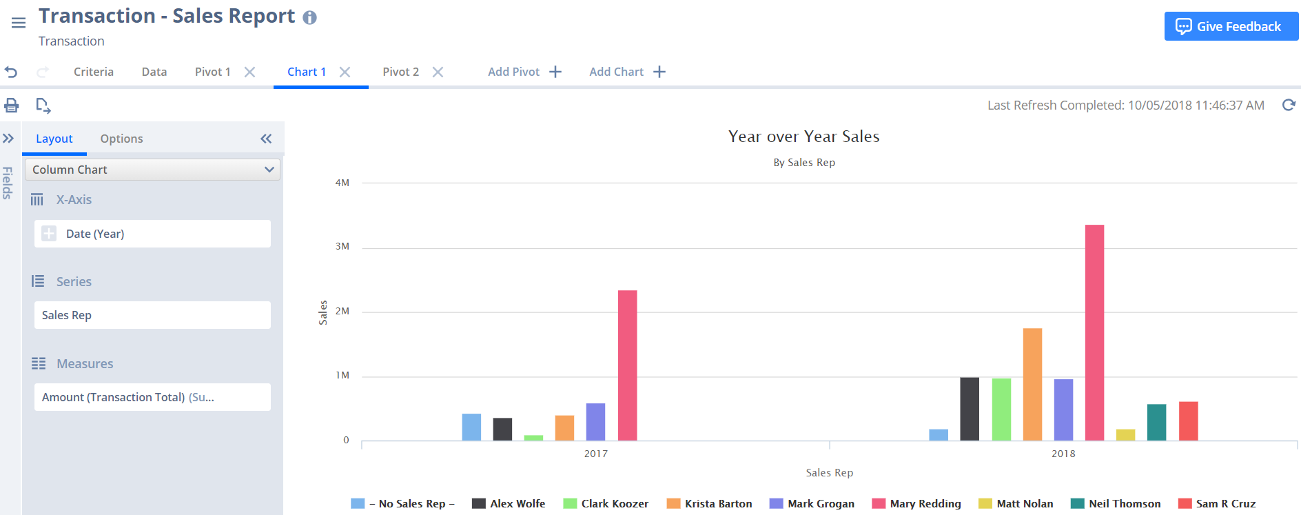
You can also view your data in a chart following the same steps you used to build the pivot table. The Options tab allows you to rename your chart and the X/Y axis. As with the pivot table, you must refresh for the data to populate your chart. Now you can export the report or chart, share with other stakeholders or save the report so that others can refresh at any time.
A quick recap of the steps is listed below, and we hope that this tutorial has provided you with the inspiration to build your own report using SuiteAnalytics Workbook beta.
- Spend a few minutes preparing for your report; ask yourself Who, What and When
- Select the base record that will serve as the building block for your report
- Add data, including multi-level joins and custom field and custom record joins
- Filter and format your data using the criteria tab
- Build the visual analysis using pivot tables or the chart function
- Save and share your report with others
Reminder that this is a beta feature and you are encouraged to send comments, suggestions and questions that will help guide NetSuite developers to make further improvements by clicking the Give Feedback button.
About the Author
Tara Dugan is a Functional Consultant at SquareWorks Consulting. She has over 10 years of knowledge in Supply Chain Planning, Manufacturing, and Distribution. As someone who has experienced NetSuite engagements as both a client and a consultant, she is committed to delivering business solutions while providing the highest level of customer service. Tara is based out of Burlington, VT.


